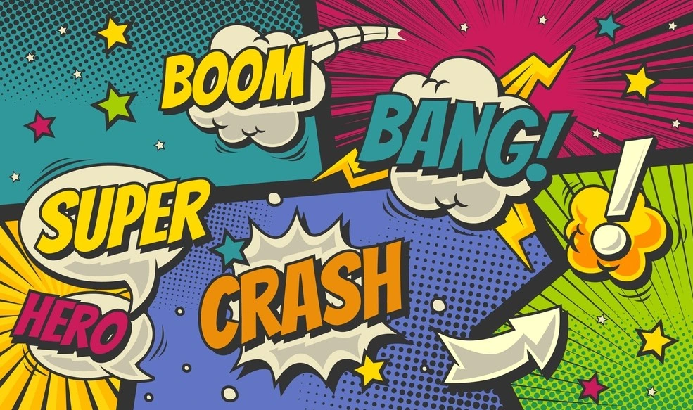
Pick up a comic or manga and pay attention to the fonts for just a second. See how they feel? A big, jagged “CRASH!” looks loud enough to wake the neighbors. A soft, curved “psst” looks like it’s barely a whisper. Same story, same art — but lettering changes everything.
Here’s the truth: fonts in comics aren’t extras. They’re co-stars. They push emotion, change rhythm, and sometimes become the sound of the character’s voice. Without the right font, even the best artwork can fall flat.
The problem? Choosing fonts is overwhelming. There are thousands, and after a while, they all blur together. Which is why this guide pulls together ten font styles — comic and manga staples — to help spark ideas.
Why Fonts Are a Bigger Deal than People Think
Lettering isn’t just filling space in a bubble. It’s storytelling.
- Fonts set the mood. Bold = intense. Rounded = friendly. Jagged = scary.
- Fonts set the pace. Big letters slow you down. Small ones speed you up.
- Fonts add voice. A villain in bubbly handwriting? Not scary.
Good lettering keeps readers hooked. Bad lettering? It pulls them out of the story.
10 Clear Steps for Choosing Comic and Manga Fonts
Let’s dive into ten styles that bring different flavors to the page. Think of this as a menu — you’ll know which one fits your project once you “taste test” them in a panel.
Step 1: Bold Superhero Fonts
Superheroes don’t whisper. Their worlds are explosive, larger than life, and packed with action. Fonts for these stories are big, blocky, heavy — the type that takes over a page before a punch is even thrown.
Open an old Spider-Man or Superman issue. The cover titles alone shout louder than anything inside. That’s by design. Bold fonts match the scale of the story. Perfect for climaxes, showdowns, or moments where silence is the last thing you want.
Expert Tip:
Try using Badaboom BB, Komika Axis, or Comic Sans Bold.
Step 2: Handwritten Manga Styles
Manga has a softer side. Fonts often look handwritten, imperfect, even a little messy. But that’s what makes them human.
They fit romantic scenes, slice-of-life panels, and light comedy. They make characters sound natural, like real voices. Readers lean in closer when dialogue feels this way. It’s not about shouting across the page — it’s about intimacy. A comic text font here helps build that warmth.
Expert Tip:
Try using Manga Temple, Wild Words, or Anime Ace.
Step 3: Gothic and Dark Lettering
Dark stories need dark fonts. Horror, gothic tales, supernatural manga — these thrive on lettering that feels uneasy. Fonts here are sharp, jagged, dripping, sometimes almost too heavy.
Look at Junji Ito’s panels. The atmosphere is already creepy, but when a character whispers in a jagged, eerie font? Instant chills. That’s the magic of gothic type — it unsettles before the reader even processes the words.
Expert Tip:
Try using Blambot Gothic, YouMurderer, or Shlop.
Step 4: Playful Cartoon Fonts
Comics can also be pure fun. Cartoon-style fonts are bouncy, round, and full of life. They fit kids’ stories, gag strips, or quirky manga.
These fonts tell readers: don’t take this too seriously. They’re lighthearted, goofy, and playful. They also work well for comedic sound effects or silly side characters. Imagine a pratfall drawn with a heavy gothic font — it kills the joke. But in bubbly lettering? Perfect. This is where a lighter comic book font works best.
Expert Tip:
Try using CC, Meanwhile, Digital Strip, or Toonish.
Step 5: Dramatic Action Fonts
Comics without sound effects feel empty. Action fonts are how BANG! or SLASH! hit harder. These are exaggerated, tilted, stretched — like the words themselves are moving.
When a fight scene needs impact, this is the font category to reach for. Readers don’t just read the sound; they feel it. A villain’s punch lands harder, a building collapses and rumbles louder, because the lettering sells it.
Expert Tip:
Try using Komika Jam, BangBang, or Feast of Flesh BB.
Step 6: Elegant Serif Fonts
Not every story is loud. Some need space for thought. Serif fonts bring that seriousness. They’re traditional, almost literary, and they slow the pace.
Perfect for narration boxes, historical settings, or graphic novels where reflection is as important as action. These fonts don’t demand attention, but they anchor it. They say: this part matters, read slowly. A serif-style comic text font works especially well here.
Expert Tip:
Try using Garamond Comic, Oldstyle Roman, or CC Secret Agent.
Step 7: Futuristic Sci-Fi Fonts
Futuristic settings call for futuristic lettering. Sci-fi fonts are clean, sharp, sometimes digital-looking. They suggest technology, machinery, and modernity.
Drop them into cyberpunk dialogue, spaceship dashboards, or robot voices, and readers instantly buy into the world. They carry a sense of sleek precision — like the font belongs to the future as much as the story does.
Expert Tip:
Try using Orbitron, Digital Dream, or Neuropol X.
Step 8: Calligraphy-Inspired Fonts
Fantasy and historical tales feel stronger with calligraphy-style lettering. Think brushstrokes, medieval script, or decorative handwriting.
They add cultural depth. A samurai duel looks more authentic with brush-style fonts. A medieval story feels more grounded when narration carries ornamental lettering. It’s atmosphere, pure and simple.
Expert Tip:
Try using Samurai, Shogun, or Blackadder ITC.
Step 9: Minimalist Dialogue Fonts
Sometimes fonts need to disappear into the background. Minimalist styles keep text readable without competing with art.
These are the safe choices for everyday dialogue. They’re especially useful in indie comics, slice-of-life manga, or serious stories where subtlety wins. Readers don’t notice them — and that’s the point.
Expert Tip:
Try using Anime Ace, Helvetica Rounded, or Letteromatic.
Step 10: Experimental and Custom Fonts
Rules exist, sure — but breaking them can be powerful. Experimental fonts let creators push boundaries. Custom-made styles, half hand-drawn and half digital, give stories unique voices.
No one else has that font. It’s your project’s fingerprint. Yes, it takes effort, but the result? Instantly recognizable. That’s the beauty of designing your own comic book font — it belongs to your story alone.
Expert Tip:
Try using DIY fonts in Clip Studio Paint, FontForge, or Procreate.
Matching Fonts to Storytelling
Here’s the shortcut:
- Superhero = Bold.
- Romance = Handwritten.
- Horror = Gothic.
- Sci-fi = Futuristic.
Testing is essential. A font that looks great alone can collapse inside a bubble. Always check it in context.
Mistakes Worth Avoiding
When choosing fonts for your comic, it’s easy to slip into habits that hurt readability and professionalism. Avoid these common pitfalls to keep your work clear, consistent, and polished.

- Using five fonts in one comic. Chaos.
- Picking fonts that look cool but are unreadable.
- Forgetting commercial licenses. Big headache later.
- Blending narration and dialogue fonts until readers can’t tell the difference.
Summing Up
Fonts don’t just decorate — they direct. They shout, whisper, scare, or amuse. They help readers hear the story as much as see it.
Exploring comic book and manga fonts is part of creative storytelling. A superhero speech feels epic in bold. A romantic aside feels intimate in handwritten. A horror scream chills with jagged edges.
Choose wisely, experiment often, and treat fonts as tools, not afterthoughts. They’re part of the art, part of the story, and part of what keeps readers hooked.
Looking for curated, story-driven font choices? We at Pixel Writing Studio can help you find the perfect voice for your comic. Reach out to us today!
FAQs
1. Do I really need special fonts for comics or manga?
Yes, fonts designed for comics and manga improve readability, set tone, and amplify emotions. Generic fonts often feel flat and fail to support the storytelling visually.
2. How many fonts should I use in one project?
Most professionals recommend sticking to two or three fonts — one for dialogue, one for narration, and another for sound effects. This keeps lettering consistent and avoids unnecessary visual clutter.
3. Are free comic and manga fonts safe for commercial use?
Not always. Many free fonts are personal-use only. Always check licensing details carefully. Investing in licensed fonts prevents copyright issues and ensures professional-quality lettering for published projects.
4. Can custom fonts make my comic stand out?
Absolutely. Custom or experimental fonts give a project its own unique voice. They require more effort but instantly make the style recognizable and harder for others to replicate.
5. Which fonts are best for digital comics and webcomics?
Digital comics benefit from clean, scalable fonts. Styles like Komika Axis or Digital Strip remain sharp across devices, ensuring text is readable whether on small phones or large monitors.
